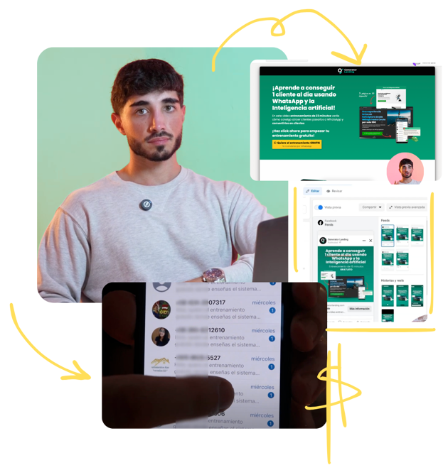
The design of a landing page can Make the difference between capturing a potential customer or losing them forever. However, many projects make mistakes that sabotage their results without even realizing it. Are you sure your landing page is working as it should? Next, we will analyze the 7 most common mistakes when designing a landing page and, most importantly, how to solve them to help you transform your conversions.
The most common mistakes when designing a landing page
When it comes to landing page errors, most of them have one thing in common: they confuse the user and reduce the conversion rate. From unclear objectives to technical failures, every mistake can be critical. Let's see which are the most common and how you can avoid them.
Mistake 1: Not having a clear objective on your landing page
One of the most common landing page mistakes is not defining a clear objective from the start. If your page tries to fulfill too many functions, such as collecting emails, selling a product and sharing additional information, it will end up not performing any of them effectively. Users need a specific reason to stay on your page.
How to fix it:
- Define a single main objective: Decide if your landing page seeks to capture leads, sell a product, or promote a specific offer.
- Simplify visual and text elements: Make sure everything on the page points toward that goal.
- Measure success with clear metrics: For example, if you're looking to capture emails, use conversion rate as your primary metric.
{{cta}}
Mistake 2: An unclear or misplaced CTA
The Call to Action (CTA) is the heart of your landing page. If the message isn't clear or isn't in a strategic place, you'll lose conversions. This includes CTAs with generic text such as “Submit” or hard-to-find buttons.
Examples of effective calls to action:
- Instead of “Submit”, use “I want my free guide NOW”.
- Highlight the benefits: “Start your free trial TODAY.”
- Place the CTA in visible places, such as at the beginning and after the key content.
Mistake 3: Overloaded and unintuitive design
A complex or overloaded design confuses the user and forces them to leave your page. Excessive visual elements, inconsistent colors, or a confusing structure can harm the user experience.
The importance of a simple, focused design:
- Use a minimalist design: Remove any element that doesn't support the purpose of the page.
- Guide the user with visual hierarchies: Use font sizes, colors, and spacing to direct attention to the CTA.
- Try intuitive navigation: Make sure the design is easy to understand even for someone who has never visited your site.
Mistake 4: Forms that are too long or complex
Requesting too much information on a form scares users away. It's a common mistake on landing pages that results in high abandonment rates. How many users want to complete 10 fields when they can do it with 3?
How to optimize a form to reduce abandonment:
- Order only what is necessary: Name, email and additional information, if necessary.
- Use dynamic fields: They help to fill in data automatically or to simplify the process.
- It offers incentives: For example, “Enter your email to receive a 10% discount”.
Mistake 5: Not optimizing the landing page for mobile
Nowadays, more than 50% of web traffic it comes from mobile devices. If your landing page isn't adapted for small screens, you'll lose a large part of your target audience.
How to fix it:
- Use a responsive design that adjusts to any device automatically.
- Make sure Make buttons and CTAs easy to press from a touchscreen.
- Check Make charging times fast also on mobile networks.
Mistake 6: Ignoring Social Evidence and Testimonials
Users trust a page that includes testimonials, reviews more or logos of satisfied customers. If you don't use them, you're missing out on a valuable opportunity to build trust.
Examples of social tests that build trust:
- Testimonials with names and photos: “Thanks to this service, we increased our sales by 40% in just 3 months.”
- Clear numbers: “More than 10,000 companies are already using our solution.”
- Recognizable logos: Include the names of relevant or high-profile customers.
{{cta}}
Error 7: Slow load speed
A technical but crucial error. According to studies, a single second delay in loading can reduce conversions by 7%. If your landing page doesn't load fast, users will just abandon it.
Tools for measuring and improving speed:
- Google PageSpeed Insights: It gives you a detailed report with areas for improvement.
- GTmetrix: It analyzes the speed and gives you practical tips.
- Optimize images and use a CDN: Reduce image size and distribute content globally to accelerate loading.
How to design a landing page that converts
Designing an effective landing page doesn't have to be complicated if you follow good practices and avoid the above errors. If you want to learn more about how to create a landing page that truly converts, we invite you to read our detailed article on the subject at This is the guide. Discover advanced strategies and take your conversions to the next level!
At Generator Landing, we're committed to helping you maximize the performance of your landing pages. From identifying design problems to implementing effective solutions, our goal is for you to turn every visit into an opportunity. If you're ready to transform your results, contact us and let's start working on the perfect landing for you.


.jpg)


